Outstanding Authors: Tennessee Williams
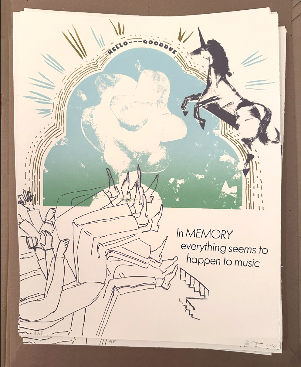
Everything seems to happen to music
These days I am feeling more confident about my letterpress printing skills. It’s exciting! I started learning about letterpress while I was working on the Cast and Recast Exhibit and learning about St. Louis’ vital role in the 1800’s as a producer of artistic lead type for newspapers and fine books. Over the years, I have learned letterpress while working on an artist’s book project with my good friend Macy Chadwick, and since then I have been incrementally adding more letterpress into the design program at UMSL.
I have also been geeking out in my free time attending letterpress conferences, which are not held in beige ballrooms in downtown hotels, but instead are raucous parties in semi-heated barn-like letterpress studios, which feature a thrilling amount of grime, and printmakers in work dungarees trading stories and techniques. In short, it’s heaven.
This summer I decided that it was time to make something serious on the letterpress. I learned a lot of letterpress from Marie Oberkirsh of Central Print a St. Louis non-profit promoting letterpress printing. When I saw that this year’s Famous Authors Print Exchange was dedicated to Tennessee Williams, I joined the print exchange, agreeing to produce an edition of 30 prints in two weeks.
I saw Tennessee William’s play The Glass Menagerie in my teens, and I remember loving it deeply. I went to church in a beautiful old Art Nouveau structure up the street from the Glass Menagerie apartments, where Tennessee Williams wrote the play, which immortalizes Williams’ sister, Rose. It’s a sad story, but many St. Louis stories are sad stories. We are a city with troubling history and adverse times. We are a city in love with the blues.
This summer I watched the play again, the 1973 version with (gasp) Katherine Hepburn at her finest, and an extremely young and plucky Sam Waterson as Tom Wingfield. In the opening moments, I realized why I was so taken with this play. It’s these quotes that arrest me:
"The play is a memory. Being a memory play, it is dimly lighted, it is sentimental, it is not realistic. In memory everything seems to happen to music"
“Yes, I have tricks in my pocket, I have things up my sleeve. But I am the opposite of a stage magician. He gives you illusion that has the appearance of truth. I give you truth in the pleasant disguise of illusion"
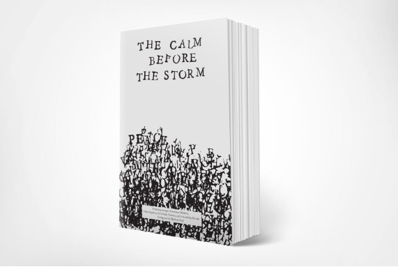
I created my poster about the glass menagerie, where the actors are trapped in amber, living in a memory. It’s my first time doing a half-silkscreened, half letterpressed final piece. I really enjoyed making this poster. I set lots of type to find the one that worked best.
This is the third print exchange Central Print has done. The Outstanding Authors: Tennessee Williams Print exchange has been on exhibit since this summer, where it showed at the Tennessee Williams Festival in August, and at the St. Lous Mercantile Library in the fall. It is currently up at Schlafly Library until January 31st, 2026.
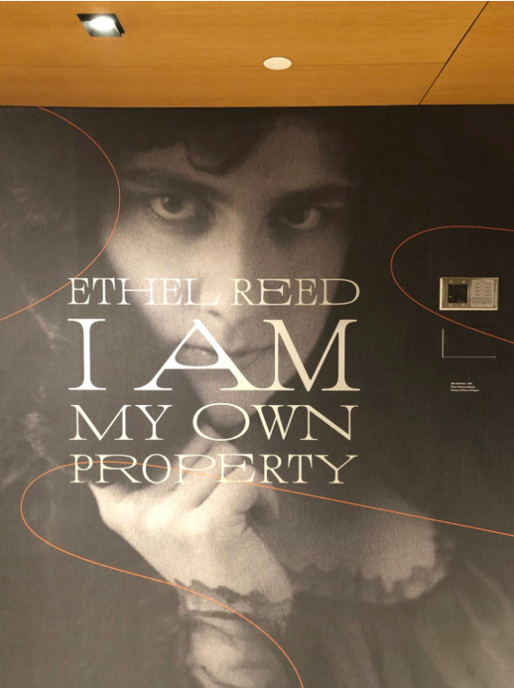
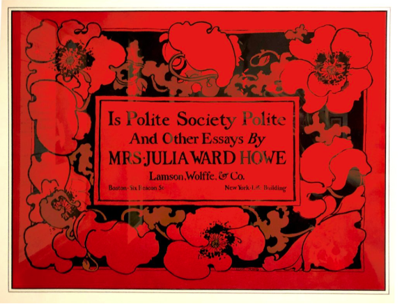
Learning about Ethel Reed
I am my own Property
This summer, I was lucky enough to saunter across a new design venue in Manhattan known as Poster House. I will admit to having a huge soft spot for poster design, and the prospect of visiting a new venue grappling with topics in poster design delighted me. It was as if New York wanted to give me a very special birthday present, and had reviewed my dreams to know exactly what would tickle me most. (!)
The visit to Poster House did not disappoint. I caught a great show on Russian Constructivism, perused their excellent shop, where I saw evidence of some other great shows, and I continued downstairs to look through a great exhibit on movie show cards.
But what I didn’t expect was the show on Ethel Reed. I was so moved by her story, which described her Art Nouveau illustrations for the Boston publishing industry, her cult of personality, fueled by several photoshoots by famous photographers, and her disappearance –swift and haunting– from mainstream graphic design history.
I was so rapt with this story, I refined my musings into the following article, which you can view on Design Observer’s website.
Thanks to Jessica Helfand and Betsy Vardell for their help in publishing this article.
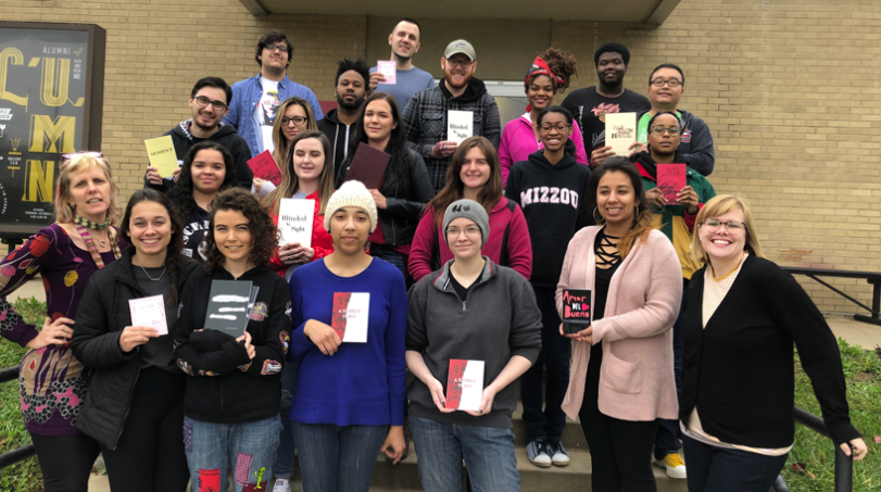
UMSL Common Read Project: If Beale Street Could Talk
UMSL’s first Common Read book becomes an inspiration for designers
work by Marlena Neal
While updating my files this weekend, I came across this lovely article about the UMSL Common Read Project from this Fall, 2019. This year was UMSL’s first Common Read project, and juniors were excited to participate by reading James Baldwin’s If Beale Street Could Talk, and typesetting excerpts of this book and pairing Baldwin’s work with writers from a number of eras and backgrounds, including Maya Angelou, Gwendolyn Brooks, Paulo Coelho, Langston Hughes and Kiese Laymon.
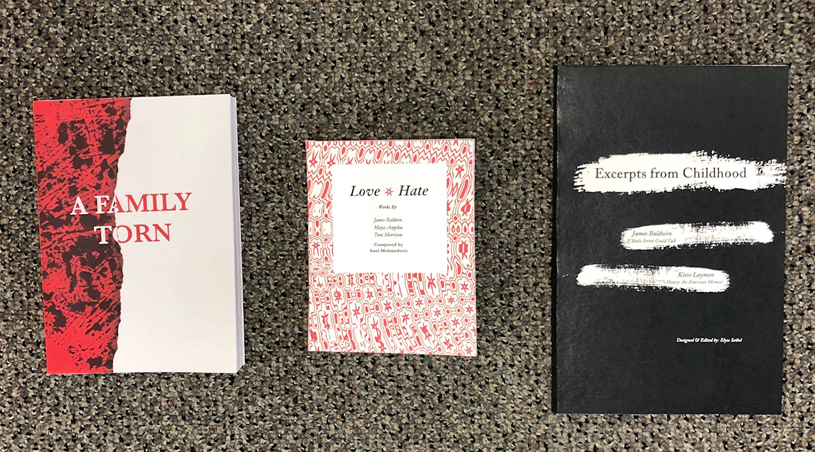
work by Landon Ruan, Anel Mehmedovic, Elyse Seibel
This was one of our most lively and interesting book projects: the text spoke to students, and each student seemed to find a different vital thread about how we live life in urban areas of the United States in the 20th century. It was a pleasure and a privilege to hear engage with this book. The classical books created for this project record the vitality of these important conversations
work by Dylan Stevens
Check out the this article and pictures of the gorgeous books here: Design students connect with Common Read through typeset project.
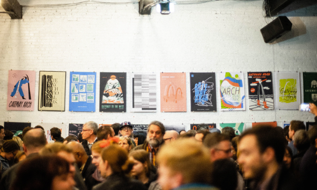
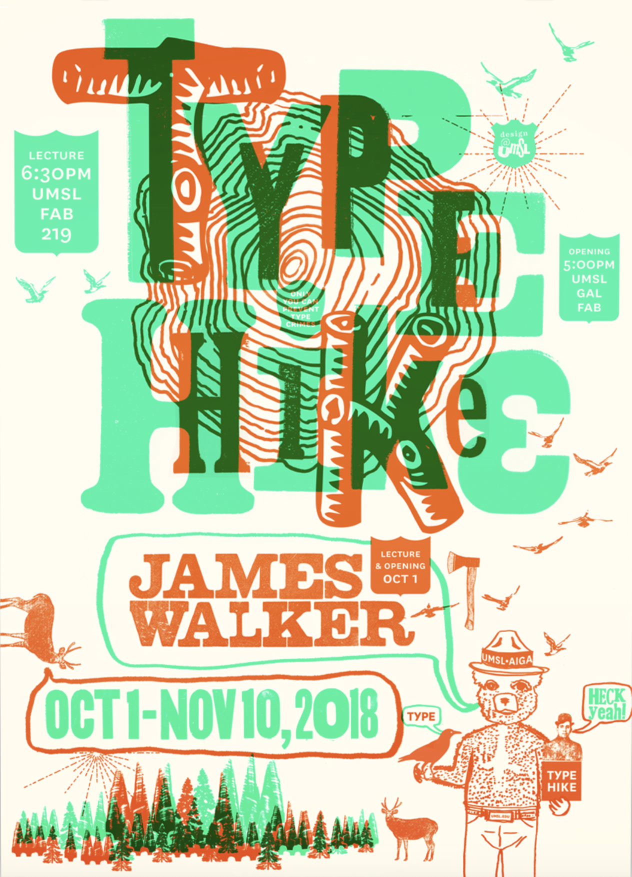
Type Hike: ARCH
63 posters made to commemorate Eero Saarinen’s remarkable structure
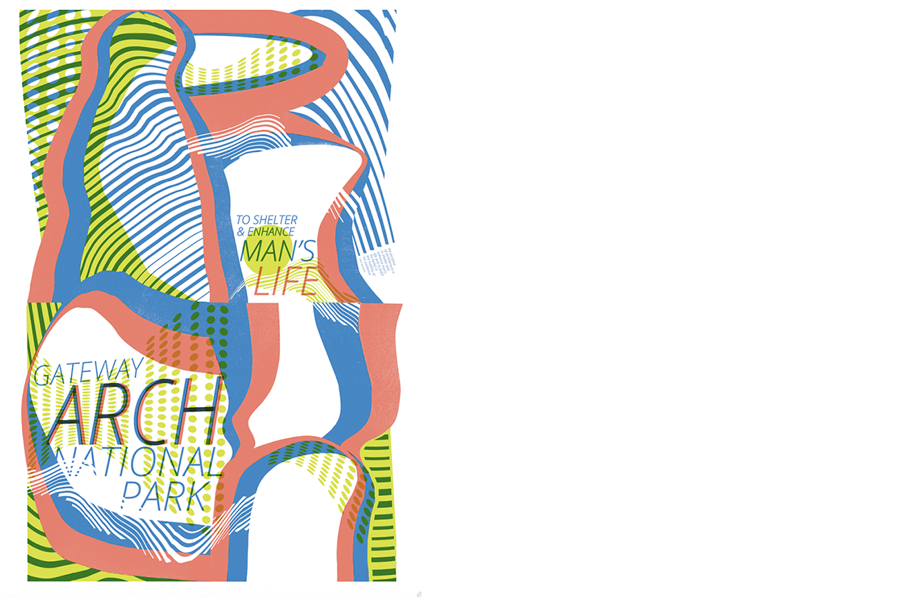
poster v.1
Last friday was the opening for a truly remarkable exhibit, Type Hike ARCH, and exhibit of 63 posters made to commemorate the opening of the new Arch grounds surrounding Eero Saarinen’s remarkable 1963 structure. If you don’t live in St. Louis, it might be hard to fully appreciate the many ways we natives have seen the arch corrupted over the years. My favorites would definitely be the Decent Boys standing on the Arch, and of course, Becky Queen of Carpet. These ads are so good, they deserve keys to the city…
But after seeing so many cliche interpretations of Arch, it was such a joy to see 63 brilliant new interpretations by so many smart designers at this exhibit. I loved so many of them. I was thrilled to see work by UMSL’s Scott Gericke and student Danielle Ridofi, as well as UMSL Alums, Marco Cheatham, Ryan Doggendorf, and Matt Marchini, and many other friends and collaborators who make designing in St. Louis a joy. The opening was packed with so many smart designers it was really really fun to see everyone and catch up. I was honored to be invited to contribute, and felt like I had been invited to Santa’s house with all the nerves and anticipation. (I guess in this scenario, Santa is played by Jim Walker, and the North Pole is somewhere in Texas…) I ended up making two versions: I am showing both here. I did this because I was indecisive and over-excited, and possibly a little sugar-buzzed like a kid on Xmas Eve.

poster v.2
I spent entirely too much time working on these posters, and did end up with something I didn’t expect, feeling like I had truly gotten to something new. After I turned in my files, I was driving past the Arch with my 12 year old son, Dylan, and was shaking my fist at the arch for being so elusive (like the Mona Lisa, with less smile, more of a smile turned upside down if you know what I mean) when he turned to me and said, “Mom, I don’t know why you worked so hard on this poster. What you needed to do was take the arch, put a kitten hanging from the top, and write “Hang In There…””
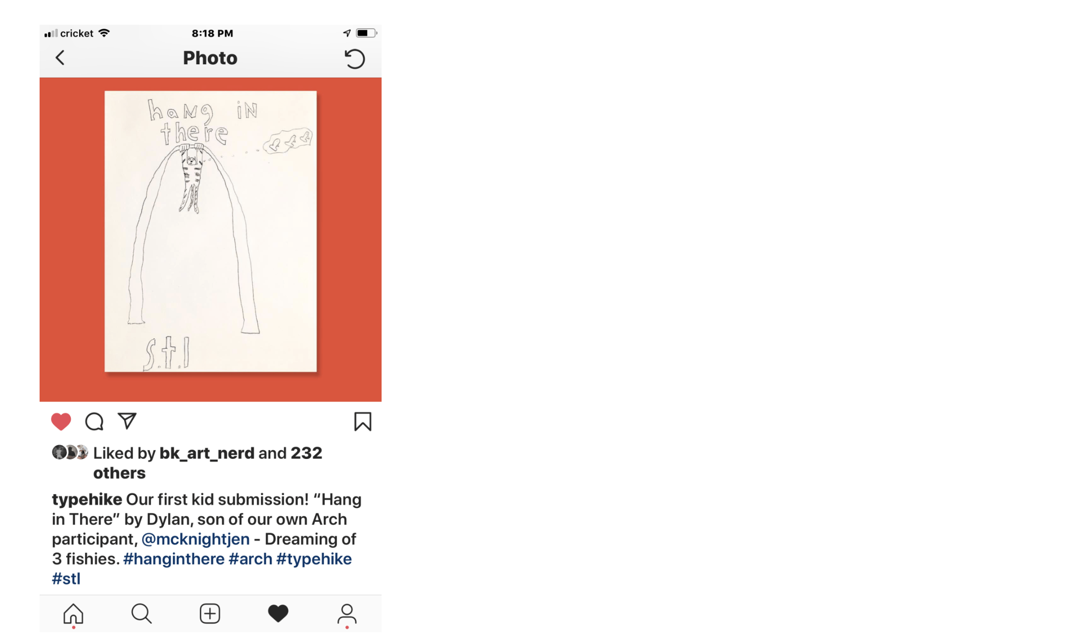
he ended up with 247 likes…I would like to say it did not go to his head…
…Needless to say I was miffed (and proud) that he had so effortlessly come up with such a good and funny idea. I dared him to draw it, and he came up with this image, which Jim graciously posted on Instagram, to Dylan’s delight. It was a thrill to watch his mind work here, and he was pleased with the likes and comments he got on Insta.
Thanks so much to Jim and David Rygiol for hosting this show! It was great to see such lovely and thoughtful tributes created for the city I love and call home.
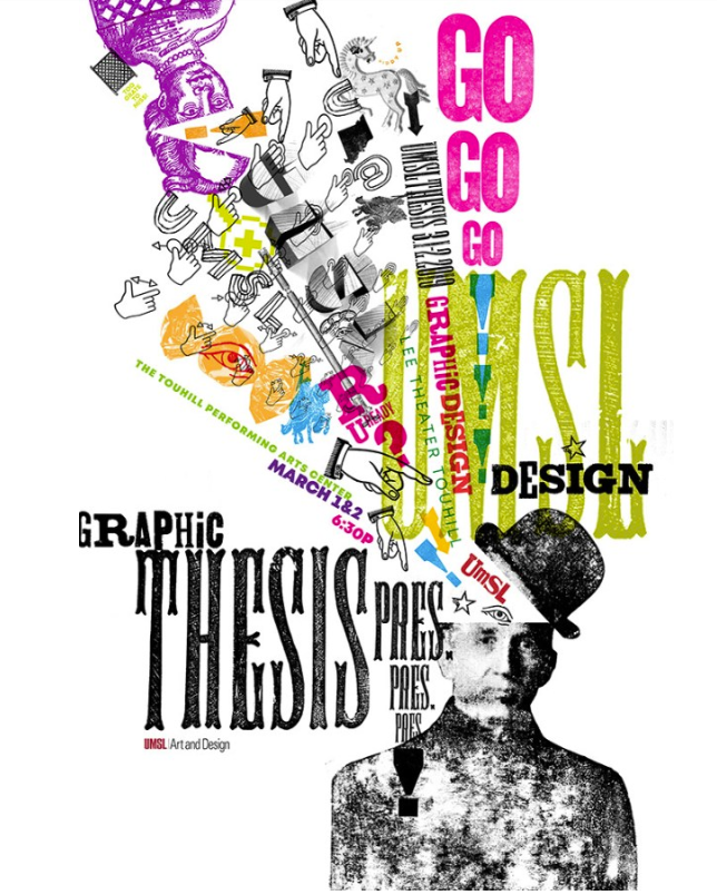
UMSL Thesis Presentations 2019
Cooking up some killer portfolios
A quick February shout-out to all of you! We have been busy at UMSL Design for the last few weeks cooking up some killer portfolios and preparing our senior class of designers. Last weekend was AIGA Saint Louis Student Conference hosted at the Webster University Downtown Campus! It was a fantastic space and we all owe a big thank you Rachel Garozzo and Katie Wisheyer for hosting a fantastic event. I was so inspired by speakers De Nichols and Bonnie Siegler, Creative Director & Founder of Eight and a Half. Each showed amazing work and inspired both the faculty and the seniors.
This week, we are getting excited to see all of you at UMSL Thesis Presentations this Friday and Saturday night at Touhill’s Lee Theater. We have 23 exciting (and maybe a little nervous) students sharing some very thoughtful and innovative projects. Doors open each night at 6 and you can peruse portfolios and enjoy some snacks, and Presentations will start at 6:30 pm sharp. We would love to see all you beautiful people! It promises to be two very fun and thought-provoking nights!
My Work Included in Mumedi Exhibit: To Death with a Smile
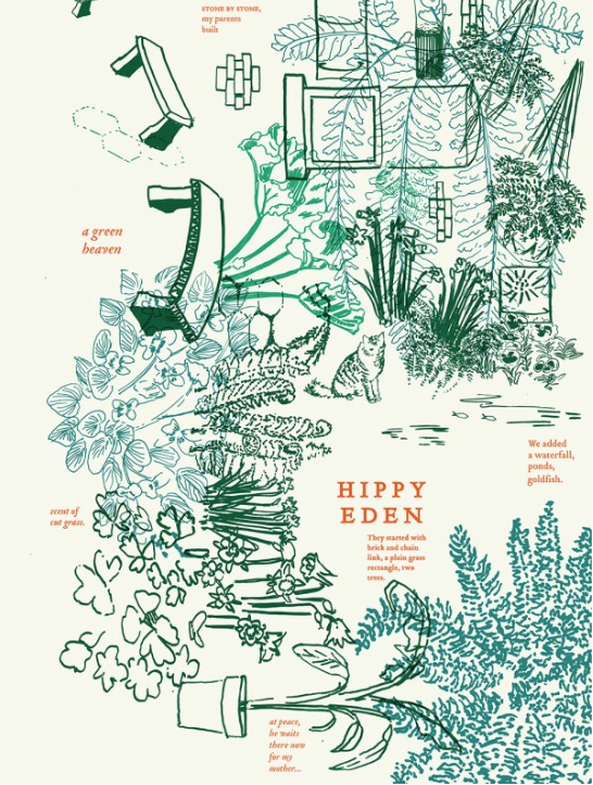
Hippie Eden, a surreal walk back into the extravagant garden
I just recently received the news that my poster, Hippie Eden, was included in this year’s Mumedi Exhibit, To Death With a Smile.
If you have never heard of Mumedi, it’s Mexico’s Museum of Design located in the Historic District of Mexico City. I have long been a fan of their exhibits, and have been trying to get into their show: To Death With a Smile for a few years. I like the message of this show: appreciate your days on this earth, and celebrate both the life and death of those persons who have most profoundly shaped you. I like the idea that in other cultures, death is treated less like a door slamming, more like a permeable barrier, possibly even a vitrine into another existence.
This year the exhibit received more than 5,000 entries, and my poster was one of 300 finalists from 29 countries.
I entered three posters this year, ones I made about the life and passing of my father, Robert McKnight. The year after his death, I took a little time to try and record his legacy, to try and make sure my sisters and I could continue to remember the complexity of him, his quirkiness, his collections, his outrageous laugh and scandalous humor.
Hippy Heaven, one of the last posters I made, is a surreal walk back into the extravagant garden my parents made in our relatively small city yard, surrounded on all sides with chain link and brick. It was their Nirvana, complete with two little fish ponds, tulips and daffodils in the spring, banana plants in large planters we hauled out each summer, a waterfall, and handmade wooden plant holders (carved with flowers by my mother) attached to our chain link fence. These held dozens of boston ferns and christmas cacti.
I think a bit of my spirit still wanders that garden in my mind, perhaps my father dwells there too, enjoying perpetual spring.
So if you happen to be in Mexico City before March 29th, check out the exhibit!
Museo Mexicano del Diseño
Francisco I Madero 74
Col. Centro Histórico. Ciudad de México
Tel +52 (55) 55108609
Nice Article in UMSL Daily about Type Hike Exhibit
Typehike Exhibition at UMSL
As I work on updating my annual review documents this year, I came across this very nice UMSL Daily article for the Type Hike Exhibit this fall at UMSL’s Gallery 210. Looking back, it was such a pleasure to host this show and work on the poster for our exhibit with my colleagues Scott Gericke and Liz Buchta.
Jim’s lecture for UMSL students and our design friends was also very thought provoking. He showed us many interesting projects, talked with the gloves off about graphic design, hard work, professionalism, having fun, and giving back. If you haven’t ever seen his project, Scroll Slow Have Fun, you should check it out. He says he barely worked on this, but he made the coolest invitation using this lenticular-style two-cel animation that he showed us.

VOX POP LA
This symposium gives some airtime to alternate American narratives
I am pleased to be presenting tomorrow at VOX POP LA, hosted by the Hoffmitz Milken Center for Typography at ArtCenter College of Design. This symposium gives some airtime to alternate American narratives, and is filled with amazing posters I look forward to examining more closely tomorrow. But wait! Isn’t that work in the front window from St. Louis? Art Center is hosting the suite of posters we made for Cast and Recast, an exhibition about St. Louis’ type houses Central and Inland type foundries. For this project, my friend and collaborator Ben Kiel made a revival of Gustav Schroeder’s 1880 typeface, Geometric Italic and we released beta versions of the face to St. Louis designers who made 23 political type specimen posters with the new face. We were proud to give more than half of the proceeds from poster sales to the Ferguson School district, as a tribute to the kind of change we would all like to champion through education in our city. Thanks to Ben and all the St. Louis designers who gave their time and talent to this project.
I spent the night in Pasadena and LA catching up with old friends and making several new ones and generally galavanting around the city. My CalArts classmates Daniela Marx and Tasheka Arceneaux Sutton and I spent part of the day visiting the posters of our hero, Sister Corita Kent of Immaculate Heart Academy in Los Angeles. Corita is the original teacher with a calling, who taught her students to give a damn, and to approach the world with curiosity, careful close observation, faith, and passion. If you don’t already know about Sister Corita, you can see her amazing posters here.
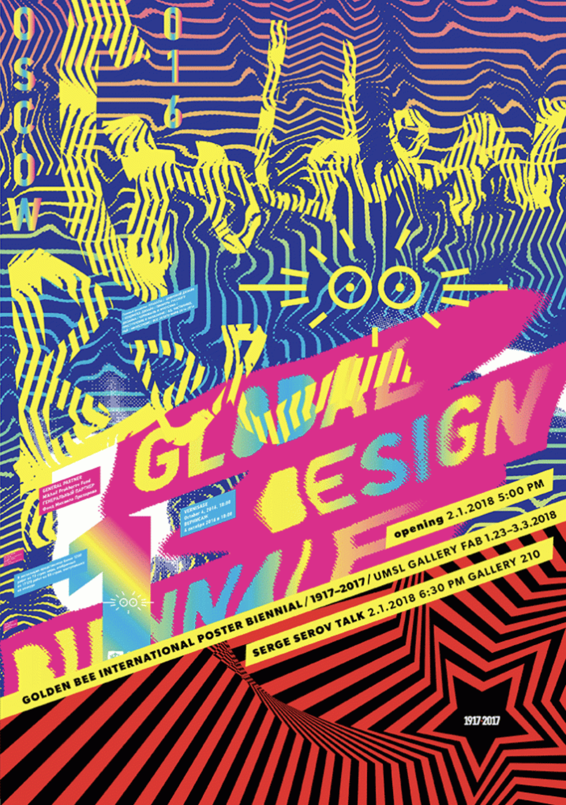
Welcoming Posters from Russia
Having a warm drink and a spirited visual conversation with 100’s of like-minded artists
Last week was an exciting first week of school for UMSL Designers! On the Tuesday after the MLK holiday, with the syllabi still warm from the printer, my new colleagues Liz Sullivan, Scott Gericke greeted the bright rested faces of our amazing students.
But this first day was extra exciting and hopeful because right after introductions and housekeeping, the junior studio students helped me hang 88 amazing posters from the Golden Bee 12 International poster Biennial!
Golden Bee is a large international poster Biennial that has been running in Moscow for 26 years or so (The announcement for the most recent call Golden Bee 13 just went out!) You can learn more about the biennial at goldenbee.org
I have been very lucky to have my work included in a few of these biennials, especially after I received my first catalog from Moscow. My heavens! The catalogs are a clearing house of sublime work of talented designers from Europe, (with great representation from Eastern Europe), Asia, and the Middle East, etc. The last Golden Bee biennial boasted 17,000 entries from 77 countries. Golden Bee was where I first learned about Homa Delvaray, Erik Brandt, Peter Bankov, Harmen Liemburg, Richard Niessen, Wei Li, Shipeng Tang, Niklaus Troxler, Lanny Sommese, Jouri Toreev, Cedomir Kostovic, and and several others who have become favorites.
As a person who longs for opportunities to travel, seeing the first catalog felt like a chance to vicariously visit all sorts or cities around the world. It was like having a warm drink and a spirited visual conversation with 100’s of like-minded artists and designers from cities I will likely never see.
As if this was not enough, director Serge Serov also sent us a second show! is a collection of 500 posters commemorating the 100th anniversary of the Russian Revolution. We will be showing these as well as a slide show.
So now you can have your own conversations! The Golden Bee /1917-2017 Opening is next Thursday February 1 at 5:00 pm at UMSL Gallery FAB at the Fine Arts Building, at the corner of Rosedale and Florissant Road. Serge Serov, the exhibition director will be there for the opening and will be lecturing at 6:30 at Gallery 210. Come meet him! Come see these amazing posters!
UMSL Daily Article about Design for Dementia
UMSL students were paired with residents from Brooking Park
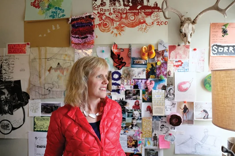
If you haven’t heard about last summer’s Design for Dementia class, where UMSL students were paired with residents from Brooking Park Retirement Community, here is an article written by Evie Hemphill, with a picture by August Jennewein. It was a pleasure working with both of them on this article: they are both truly masters of their craft, and it was such a treat to see what they made of what we do at UMSL Art and Design. Thank you to both of them for this article and image.
I am in the planning stages for a very interesting next iteration of this class scheduled for Summer Session 2, 2018. I am exploring a collaborative class with a colleague from Kent State to make this summer’s class a rare and rewarding experience this summer.
A note about the picture: August has generously agreed to let me use this picture for my site photo. The wall behind me is my office wall, where I have collected beloved pieces from many students, friends and colleagues from the UMSL community over the years. Last summer I moved offices, and found myself slavishly recreating it on a new wall. Life without all the little pieces left behind by so many alums and community members: it just wouldn’t be the same. I remember all of you, and am still treasuring the privilege of the time I spent with you, watching you grow, and learning from you as much as you ever learned from me.
Jennifer McKnight’s new class pairs design students with dementia patients – UMSL Daily
BLOGS.UMSL.EDU
Lessons from Berlin
This kind of recording urges us all never to forget, lest we repeat this history
Last week I spent a day in Berlin on my way to Amsterdam. Berlin is a mecca of interesting museums, but one that particularly struck me was the DDR museum, the Deutsche Democratic Republic, or the museum of Soviet occupied Germany. After writing recently about memory, I was surprised to remember again that Berlin was deeply buried within the partitioned East Germany, which meant that this cosmopolitan city was often at the mercy of the Soviet Union for supplies brought by truck. This vibrant city was partitioned into 4 sectors at the end of World War 2.
There were many interesting moments in the DDR museum: both the sublime and the ridiculous. I thought that it was particularly interesting that the training to become a good socialist began with group toilet training, where each child sat on a single board with multiple holes, and waited until all children were finished to leave. There is something very telling about having to share even this most private human moment with your community.
I also visited the museum of German history. Here, I was once again struck by the role that design played in turning Hitler into a cult of personality. The display started with posters after World War One, expressing German dissatisfaction over the heavy reparations they were forced to pay WW1 victors, tariffs so high that Germans were left starving.
The early posters of the Third Reich offered simple solutions to these issues. And took credit for many corrections that were actually set in place by the Weimar Republic. They were strident Red and Black posters promising simple solutions.
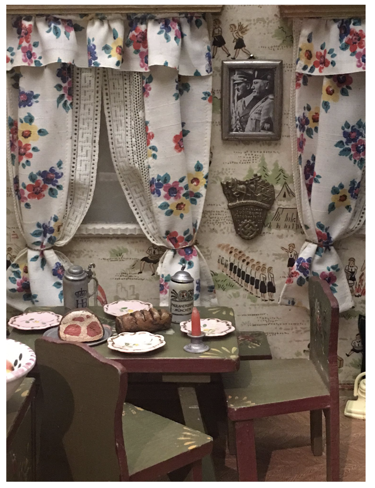
One of the most chilling displays for me was actually a children’s dollhouse, in which hang portraits of the leaders of the Third Reich, another early inculcation into a particularly dark brand of patriotism.
It occurs to me that the Germans were people in crisis looking for a savior, who made the mistake of responding to a man who preached slick and simple sound-byte answers to large problems. The darker objectives of the Third Reich were draped in nationalism, which isn’t in itself a bad thing, but this was the sheep’s clothing hiding the wolf, Germany’s desire for larger control and wealth. As I looked at how faithfully the city of Berlin doesn’t shrink from its dark past, but articles the history, it makes me think about the US, and how hard it is for Americans to own their nation’s collective mistakes. It occurred to me how hard it might be to live in Berlin today, surrounded by documentations of a dark past. But this kind of recording urges us all never to forget, lest we repeat this history.
Germany has mounted these exhibits to make sure that they, that we all, never forget the lessons of World War 2. This warning seems especially sobering for Americans, as we live in a country whose leadership feels so out of control. It is tempting for so many of us to do what the East Berliners did before 1961, and vote with our feet, moving away from the United States and a regime that seems so ungainly, so large and inefficient, and so often wrong-headed.
Memory Palaces: on Remembering
I find it hard not to get carried away by the seduction of charmed objects
This week I am working on a show for Millitzer Gallery called “Remembering”. It’s been good to take a look again at the posters I made last fall, and what more they are offering up after a little time to reflect. For each piece I wrote a blog entry, and many of them now seem a little too raw for personal consumption. An ad agency I worked for had a dress code rule about nakedness that seems instructive here: “Don’t show us anything we don’t want to see.” I think this rule applies for nakedness of the heart and soul just as clearly as it applies to nakedness of the body. Here though, is one tidbit I thought you might enjoy:
This last year I have faced some $24,000-question-type problems: the question of when to respond with practicality, and when to respond with the heart. It’s been a year of tricky problems: human problems, daughter problems, sister problems, caregiver problems, mother problems. These have proven difficult to navigate with the tools I have honed through my profession, as it seems to me that design prides itself on the practical, and is suspicious of the whiff of sentimentality.
We all like to pretend that we design in a pure space: an office where every detail has been attended to and considered to create highly effective and efficient communication. I have a beautiful space like this at UM-St. Louis that I love and use, but the vagaries of single motherhood mean I spend a lot of time working at my crowded kitchen table after bedtime. This messy, busy, multipurpose space suits me. It fully recognizes that my time is divided by a sea of myriad duties, all of which I chase down, pursue, and juggle with higgledy-piggledy, passionate exuberance.
Life isn’t clean, pure, or idealized. If it was, I would never have the career that I am so fulfilled by, or the family I never imagined. I would also never have allowed or planned for my father to recede and pass away last year in they way he did. It seemed so cruel a fortune for him to move my mother and himself back to St. Louis from Hannibal, and then for him to leave so soon after, with hardly a sweet family moment before he was too sick to enjoy much of anything.
My sisters are so far from St. Louis. For them, the decline of my mother and passing of my father was more terrifying. They were remote from the day-to-day, and as every bit of what we call home began to slip away at once, they struggled to respond in ways their hearts felt appropriate. In a year, we lost not just my father, but my parents’ house full of belongings, which my father didn’t have time to sort and attend to before he fell ill.
My mother, an artist, had dozens of framed prints and watercolors throughout the house: so many it was impossible to keep them all, and very difficult to sell them or give them away. She also made dolls and dollhouse rooms, so after we sorted her pictures, we needed to consider her many handmade porcelain dolls, room boxes, plants, carvings, castles and collections.
My father collected model trains and constructed by hand a massive Lionel train layout, each building weathered by hand, each window filled with a scene from his imagination. The layout contained a small city, some mystical bedroom community that greatly resembled his hometown in Virginia circa the 1940s. They also collected many pieces of my art from different periods of my life. For me, these were the easiest to jettison.
My sister E called their home a sea of priceless bibelots. We could drown in this house so filled with trinkets, symbols and memories, so many of which were made by our parents’ hands. She and I, and my sister Anne as well, are haunted by these trifles, resurfacing as they do in our thoughts. We couldn’t keep them all, and the problem of dispatching them was daunting. In the end all the family’s antiques and collectibles were sold for a song. I recently found my father’s handwriting on some of his train photographs on Ebay. It was heartbreaking to see them there, and yet, there was simply no way to hold all their collections, and still have room for our own family’s stories.
My mother collected acres of things. She has the heart of a hoarder, and still craves the toys she didn’t have as a girl. She (with three siblings) was raised by a single-mother schoolteacher in Mississippi. Money was often tight, and she was forced at different times to live with gruff and disagreeable grandparents, in spaces that were not hers. Her things make her feel safe.
I went back several times to my parent’s house in Hannibal. Each time, I felt buffeted by things, both sublime and ridiculous, and the emotions they evoked. Each “last time” I returned (and I did keep having reasons to go back and say goodbye again and again) was the last time I would ever know a home that the two of them constructed together, and lived in independently. Each tiny piece hinted at their sweetest days together, their golden retirement on the bluffs of the Mississippi River, their sunset days – the glowing brilliant lives of a complicated and very idiosyncratic pair. I resisted the great mass of things at first, and then found myself sticking a single exquisite rock in my pocket, or a practical object I still needed in my new home, some kitchen scissors, a roll of tape. This, however, opened the gates for the sea of so many small objects of desire, as numerous as seashells on the beach. By the time I left my pockets would be full of memories I could not quite bear to leave behind.
Things aren’t memories; memories aren’t things. But as a maker of artifacts, even ones meant for mass production and disposal, I find it hard not to get carried away by the seduction of charmed objects. Here simple objects become a short-hand for big ideas: one’s concept of beauty, life goals, the value one places on the path less traveled.
What objects my sisters and I took away from this house, and with them what memories, values, viewpoints, and culture systems, became the impetus for this show. My parents are largely responsible for my place in design: my endless curiosity for the workings of culture. Their rebellion against cultural conformity and vigilant pursuit of the unique, arcane, and idiosyncratic allowed me to see cultural practice for what it is. Culture is a short-hand, born so often of path dependence. Their disavowal of norms led me to question why we value and find beautiful and moving what we do. It was one of their greatest and most memorable lessons. This show attempts to marshal some of the objects and ideas my parents held dear.
Some Thoughts on Memory
What does a memory palace really look like?
This week I have been working on my show at Millitzer Gallery, Remembering, and working on a few site-specific pieces to accompany the set of ten silkscreen posters I made last summer and fall. I wrote this reflection for the exhibit:
What does a memory palace really look like? How does one enter? How clearly can one really see?
This show is about the act of remembering. We construct memory palaces–shrines to our past–to help us choose what memories to keep and what to forget. Memory is tricky: it dissembles. You can be absolutely sure that you remember something perfectly, but with the passage of time, memories become anything but accurate.
This show is in part about remembering my father, and the odd and beautiful ways that he and my mother chose to raise their daughters. But this show is as much about that act of remembering. It is startling how false and colored our memories really are, how manufactured, even as we aim for accuracy. They are as much a creation as anything I ever make in the studio.
My mother has dementia, and there is a poetry to what she remembers and what she forgets. She always knows which days my sisters are coming to visit her and will sometimes be waiting by the front door for us to arrive. She forgets what she doesn’t want to remember: the loss of her home, the fact that she can no longer drive or babysit, and which days my sisters are leaving. She doesn’t remember her pains or the depression that used to plague her. She lives in the filtered present, and what she forgets leaves her happy, contented.
But we all unwittingly choose and curate our memories. To prepare for this show, I made a trip back to my childhood home in search of inspiration for the show wallpaper. I was fascinated with the blue wallpaper that adorned the front hall of our family home. It was an odd formal pattern: I stared at it for hours as a child trying to discern if the shapes within were pansies, or maybe diamonds or eyes, or something else altogether. It defied definition. I recall seeing the paper there when I visited the house two years ago, right as my father’s health began to fail. But when I returned this week I found that the paper was gone, and that my memory of it two years ago was a figment of my imagination; the new owners in fact had never seen it. My memories of it were a story I had manufactured. Now, this wallpaper, like so many of the trappings of our childhood, exists only as an imperfect amalgam of our families’ collective memories. I asked each of my sisters to draw it from memory to make the paper that hangs in the show.
Graphic Design Thesis Presentations
Grateful to be a Part of Senior Seminar
This year was an amazing year for Thesis Presentations at UM-St. Louis. I was truly grateful to be a part for Senior Seminar this year. Check out this great article in UMSL Daily. Thank you to Evie Hemphill for the excellent article and photo.
NPR Article about Autism and Motion Perception
Neurodiversity sets forth that there are many brains
One of my new fascinations is the idea of Neuro Diversity, which basically states that the idea of categorizing brain as normal and abnormal is limiting. Neuro Diversity sets forth that there are many brains, and each are better at some tasks, worse at others. This article from NPR about Autism and perception of motion fits quite nicely into this kind of thinking. http://www.npr.org/sections/health-shots/2013/05/09/182717089/kids-with-autism-quick-to-detect-motion

AIGA St. Louis Student Conference: Lecturers with a Conscience
getting designers first to care and second to adopt even a greener lifestyle
February 26, 2017
This year’s student conference was an especially thoughtful one. Set in what one could call one of the more earnest parts of town, This year’s conference chairs Audra Hubbell and Anna Heinze lined up a number of nice surprises for us.
There was an inspiring talk about time and making sure to use it wisely by Dawn Hancock, of Firebelly Design in Chicago. This was just the kind of talk that students walking out long nights in studio need to hear about overcoming one’s demons and being brave.
But I was particularly moved by Jonny Black and Richard Roche’s presentation. Black and Roche, who had traveled from Cast Iron Design in Boulder, Colorado, may have started with some jokes, but quickly it became clear that they were here to impart an important message about how to start and scale an environmental design practice.
I had to admire how they approached the problem of getting designers first to care and second to adopt even a slightly greener lifestyle. The problem here is that any time someone starts talking about the environment, we tend to all get so overwhelmed that we aren’t listening.
Jonny and Richard very clearly told us that we could be good without being perfect, and they gave us two easy first ways to start: two takeaways that would be simple for almost every designer, young or old, to adopt.
A surprise fact I recently learned that Cast Iron Design underlined in their presentation is how large the effect is of passing on meat in a single day. Kathy Freston of the Huffington Post quotes this staggering statistic:
“According to Environmental Defense, if every American skipped one meal of chicken per week and substituted vegetarian foods instead, the carbon dioxide savings would be the same as taking more than half a million cars off of U.S. roads. See how easy it is to make an impact?”
For the full article see here: http://www.huffingtonpost.com/kathy-freston/the-breathtaking-effects_b_181716.html
From the point of view of a St. Louisan this feels like good news. It’s something I really would consider adopting without very much of a pinch. St Louis is a city whose infrastructure prevents me from commuting in other ways, and if I have to drive, it’s nice to hear there is another way to help.
Jonny and Richard’s second point was a message-in-a-bottle to young designers about to go out and start spec’ing papers for print jobs. The message was simple: start with spec’ing papers with higher recycled content. They pointed to New Leaf papers, http://newleafpaper.com/ and specifically, to checking out a paper’s percentage of recycled post-consumer waste. They called it the gateway drug to being an environmental designer.
Cast Iron also designed a great tool for designers trying to adopt better practices to keep going. Their company blog explains how else we can consider the environment in our decisions, making small changes that make big impacts. I appreciated all the small ways this company chose to spread their message, and also the reminder that for many clients, this is a reason to choose their company, that sometimes doing good is also just good business.
Cast Iron’s two easy-to-adopt ideas combat what my student Mary describes as the “we’re all gonna die” sinking feeling that ends every discussion of the environment these days. Instead rocking in a corner we can commit to making micro-adjustments that could really help our planet.
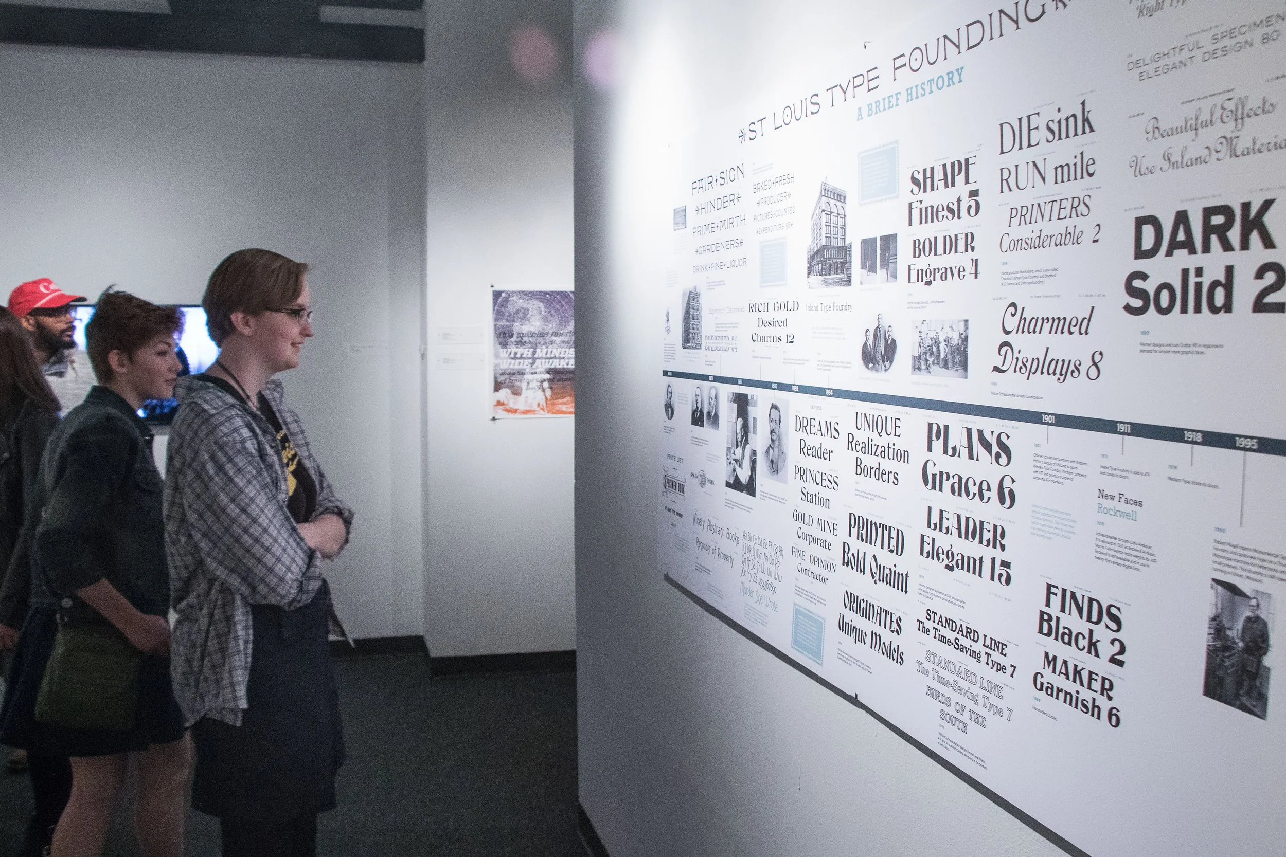
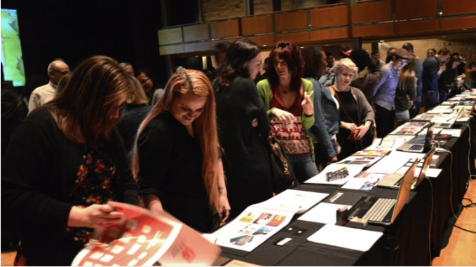
Thoughts on the Exhibit: Cast and Recast St. Louis Type Design Present and Past
These typefaces feel like home
July 6, 2016
I sometimes forget that one of the most important and exciting parts of teaching is the part where the teacher gets excited about learning and walks in the students’ shoes for a while. The last few weeks have been such an excellent example of that. I have been working on a show for UMSL Gallery 210 called Cast and Recast: St. Louis Type Design Present and Past. The show has really been challenging, and ultimately very rewarding, to organize, collect for, orchestrate, and finally design.
The reward has been remembering how much, how very much, I love to learn! Seems obvious, no? My grad advisor Lorraine Wild once said that graphic design is for the “intellectually curious.” Every time we do our job, we have to (or get to, depending on how you choose to frame it) become mini-experts on the topic we are designing for.
This type show was just such an experience. Truth be told, before this show, I really didn’t feel like I knew that much about type design. That’s why I wanted to have the show in the first place, I wanted to do a type design show so my students could learn about type design, but secretly, I also wanted to do the show so that I could learn about type design. I love learning through meeting people and having them share their stories, so I started with a concept that would bring lots and lots of type designers to campus to show their craft first hand. We brought Krista Radoeva to campus last year and she did a type design workshop and it was great, and we all started to learn about type design through her workshop. The year before that we had Ken Barber of House Industries to campus, and we were also lucky enough to have a lecture by Paul Barnes and Christian Schwartz of Commercial Type in St. Louis. The whole city was getting warmed up to type design together! Thrilling!
One of the big thrills of this project was getting to know Ben Kiel better. Ben runs Typefounding, a digital type foundry in St. Louis. Ben went to Reading after attending Wash U and had all kinds of interesting insights and type foundry names that opened up type design for me. It was Ben who first pointed me to St. Louis’ history as a type founding city and Robert Mullen’s book….
For me, the most exciting moment was when I realized that I really LIKED these old typefaces. There is something unquantifiable about home, something magical about the familiar. Living in St. Louis is like living in a pleasant time warp. So much of this city harkens back to the turn of the last century, a time when our reputation was legion, a time we were a viril industrial giant. The libraries are full of books from the 1850’s through 1920’s, including many original designs by one of my favorite designers William Addison Dwiggens, and these books are reclining sleepily on local shelves. We live in beautiful stone structures that were built during this period: we all drive absentmindedly by the Wainwright building, and many lovely edifices by O. Winston Link. These don’t feel special or old to us, they feel like home.
So for me, when I first saw Gustav Schroeder’s typefaces that he designed for Central Type Foundry, it queued some music in my head, I heard a turn-of-the-century violin waltz, and saw the sweeping dresses of ladies walking Tower Grove Park, waltzing in the band stands and enjoying the World’s Fair. There was something palpably familiar, right, home. I would almost say, I recognized them, like so many St. Louisans walking around our big-small-town.
I love these typefaces. I love their old, lofty, and decidedly out-of-fashion grandeur. It’s these pre-modern roots that have always made me such a fan of post-modernism, the reframe of the quaint, arcane pre-modern. I am decidedly a maximalist. I do not believe in essentializing, and throwing out the frills. I think that the frills, the little moments, are my favorite moments. Those are the grace notes I replay in my head when I close my eyes to go to sleep. Those small graces are the answer to the question about what is so great about this world? What makes you happy? What do you savor?
For more about this exhibit, visit the website at www.castandrecast.com.
You can also hear an interview about the exhibit on St. Louis public radio here.